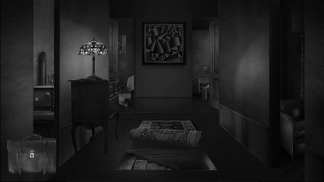
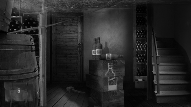
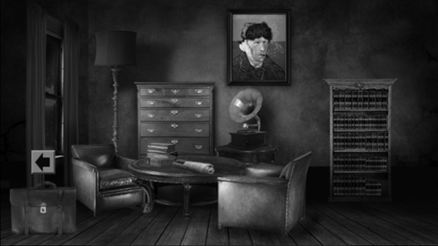
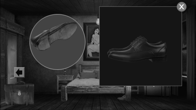
When I first saw the screenshots of The Paris Dossier I was pretty damn excited. I’m a massive fan of the point and click style adventure; it’s a real popular genre that saw its maturity in the days of the flash game, thanks to game portals like New Grounds. Being an active user of said website and the like, I have been treated to hundreds of click adventures over the years, and boy there have been some good ones (Exmortis anyone?).

The Paris Dossier has a lot to live up to simple by being a game of this genre. And though it has some intriguing themes and teaser images, it fails at living up the picture it paints. It’s a bit like watching a movie trailer for Shamalaman movie, loving it, then walking out of the cinema mid movie.
The game starts out against a Black and white setting of early industrial Paris, which kind of reminded me of Broken Sword 2.
Instantly you are greeted with a screen of text explaining a back story of sorts. I would have liked this to have been voiced, if only this part of the game (nothing else is). But alas your first experience with the game is reading a fat block of pretty generic text, which does little to set any mood or atmosphere for the preceding game.

The game itself is pretty typical as far as this kind of game goes. Click/touch object and doors, collect items to use later.
The connection between objects is generally quite good, however I feel like often there were continuity problems between screens in terms of spacial positioning, you know, how you click on a door then end up on a screen that doesn’t match the angle you came from, this can quickly become frustrating.
The general ambience could have been much better as the game has a great base in its styling an Parisian theme. I would have loved to have heard some atmospheric sounds, some rain drops, distant thunder rumbling or anything for that matter. Clever sound design would have helped to make the experience more immersive as is expected with this genre. Instead it feels more like a slide show of pictures.
I generally have a lot of patience when I play/ review games, especially genres I like, but in this game I found myself just tapping the screen mindlessly looking for the next click area.
There is little to no audio feedback in the game when interacting with objects, no draw opening sounds, trap doors creaking open, nothing, just a short music loop which plays over and over.

Which leads me to my next gripe. I found a few annoying touch spot issues… In the second screen of the game there is a large double arched door. I touched the door, nothing happens, not even a sound, ‘maybe it’s not even touchable’ I though, so I went back to the first screen, nope no key to find here. After tapping every pixel on both screens, I once again tapped the door I originally tried, and like magic it opened. Turns out I had to touch this door specifically on the left side. Really? Then why make that freaking door so big, and considering most players are right handed they will likely have tried the right side first too. It’s little decisions like that which do a lot to make or break an experience.

Ok, I’m not done yet, one more final observation which ruined the game for me. There is a noticeably lengthy load time between room transitions. Even when playing on an iPhone 6 the load times were up to 5 seconds, to what, load a few low res images? (They are very notably low res on Retna screens).
I was initially going to end this review with a positive remark, but after a second then third play attempt, the games flaws became more apparent. I tried to find something that would convince me ‘hey this ain’t so bad now’. Lets just say I got tired of looking.
But of course this is one man’s experience… go nuts.


No comments